
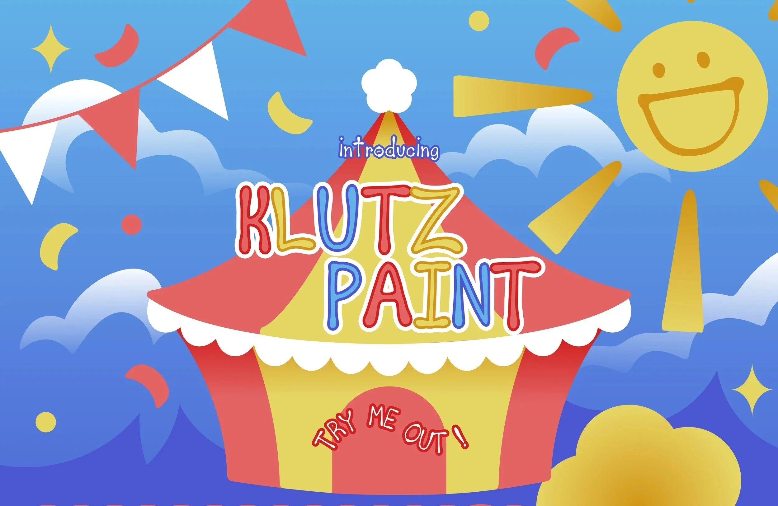
Klutz Paint & Type Specimen Page
The goal for this project was to design a type specimen page for a font that reflects the personality of the font, informs users about the font, and offers instances for a possible user to see the font in use.
The Initial Process
Selecting a font & Research

When working on this project, I had decided to go with comic sans. Not the most conventional of choice keeping in mind the reputation it has gained for its misuse, but I wanted to show it in a light that made sense for its intended purpose
What I found from my research is that comic sans was initially intended to be used for the program “Microsoft Bob”, which was used to get users more familiar with using a computer. The reason why the idea for comic sans came around was that the font choices they had felt too formal for the program, and wanted something more friendlier and casual.
Creating the assets
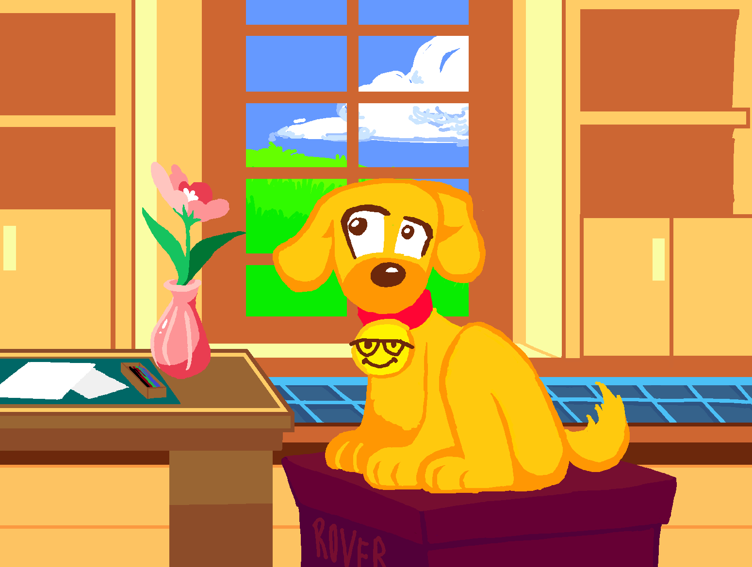
For the assets, I created the different assets in firealpaca & microsoft paint without the text, as the text would be added in another program
Putting things together
To mock it up as a scrollable website, I brought in all the assets into Figma, and added the text
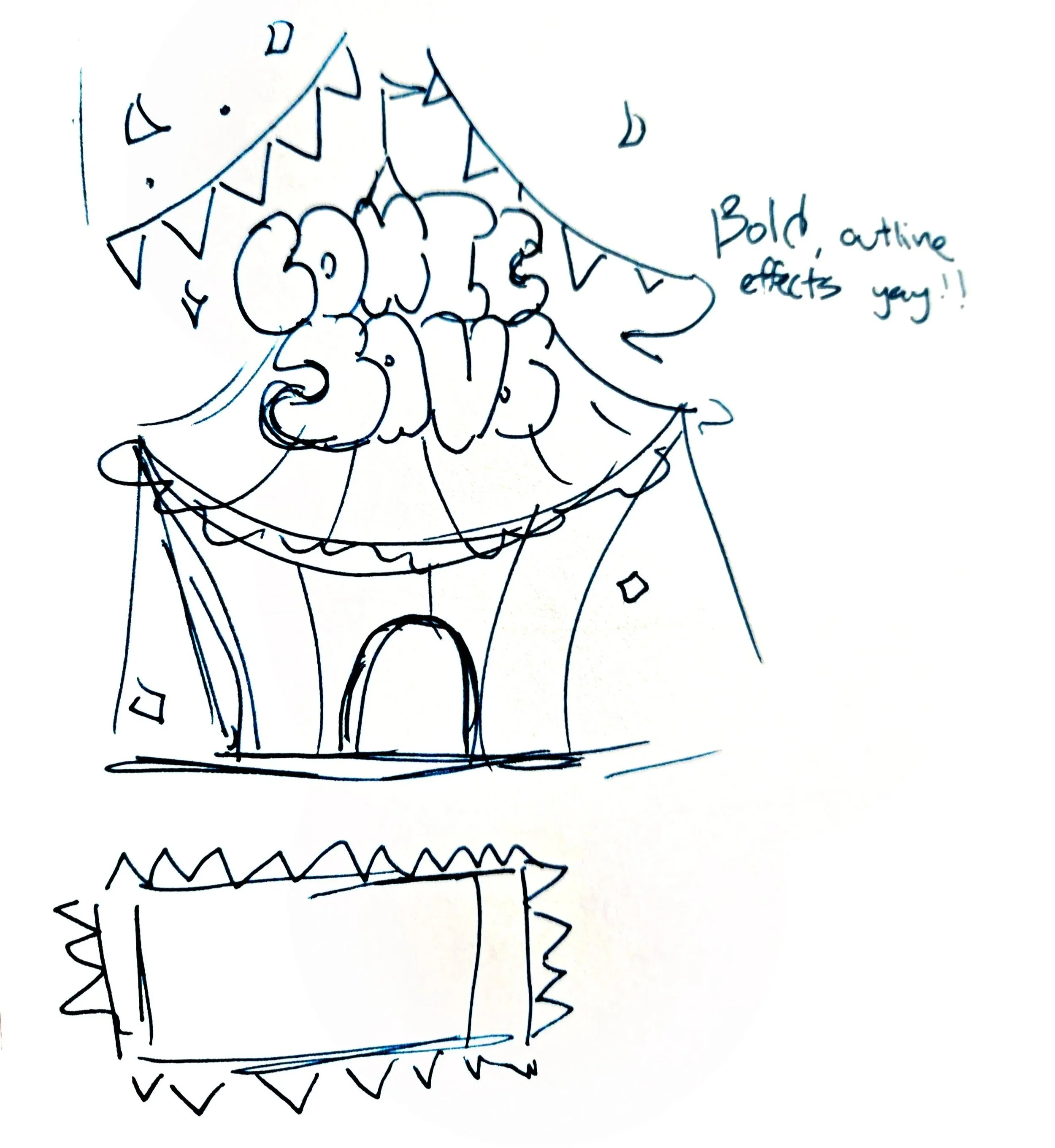
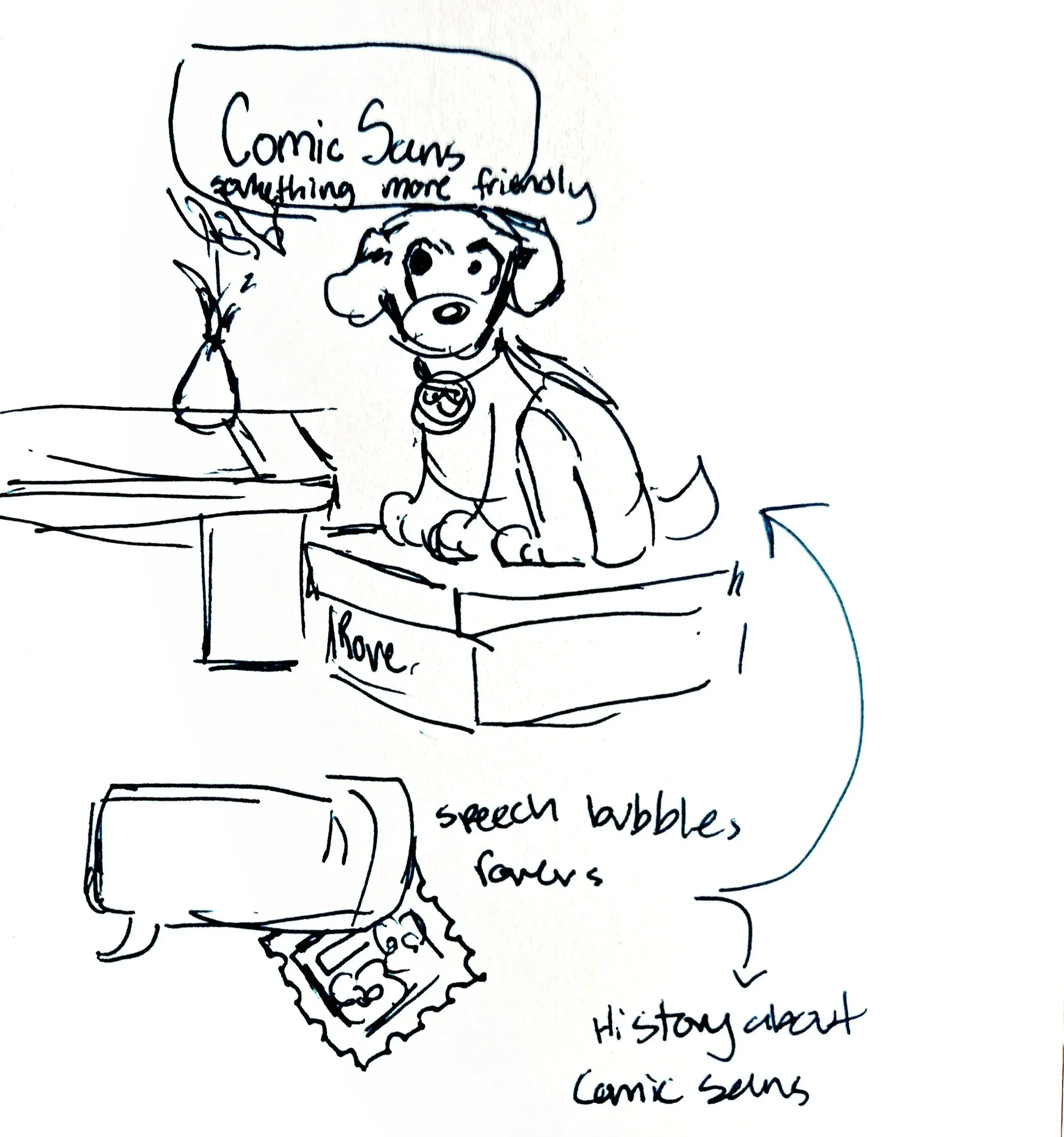
Sketches
From my research, I decided to go with 2 concepts:
A circus theme to represent the unserious nature of the font, and to show it in a more playful and childlike setting that it has been used for
And Microsoft Bob themed, revolving around the origin and history of the font with more old-school windows visuals.
Revising
Receiving feedback
Though I like the results that I created, I felt there were ways to improve this project, as I wasn’t 100% satisfied with it. Seeking out some feedback from my peers helped to give me pointers of where things were lacking, most notably on the illustrative side where I could play around with them more, and with that I started to think about how I would revise things.
Redirecting the Project
There was one note of feedback that I received that made me really challenge myself, and that is the fact that Comic Sans isn’t my typeface. With that in mind, I decided to pivot away from making this a specimen page for comic sans, but an entirely new font
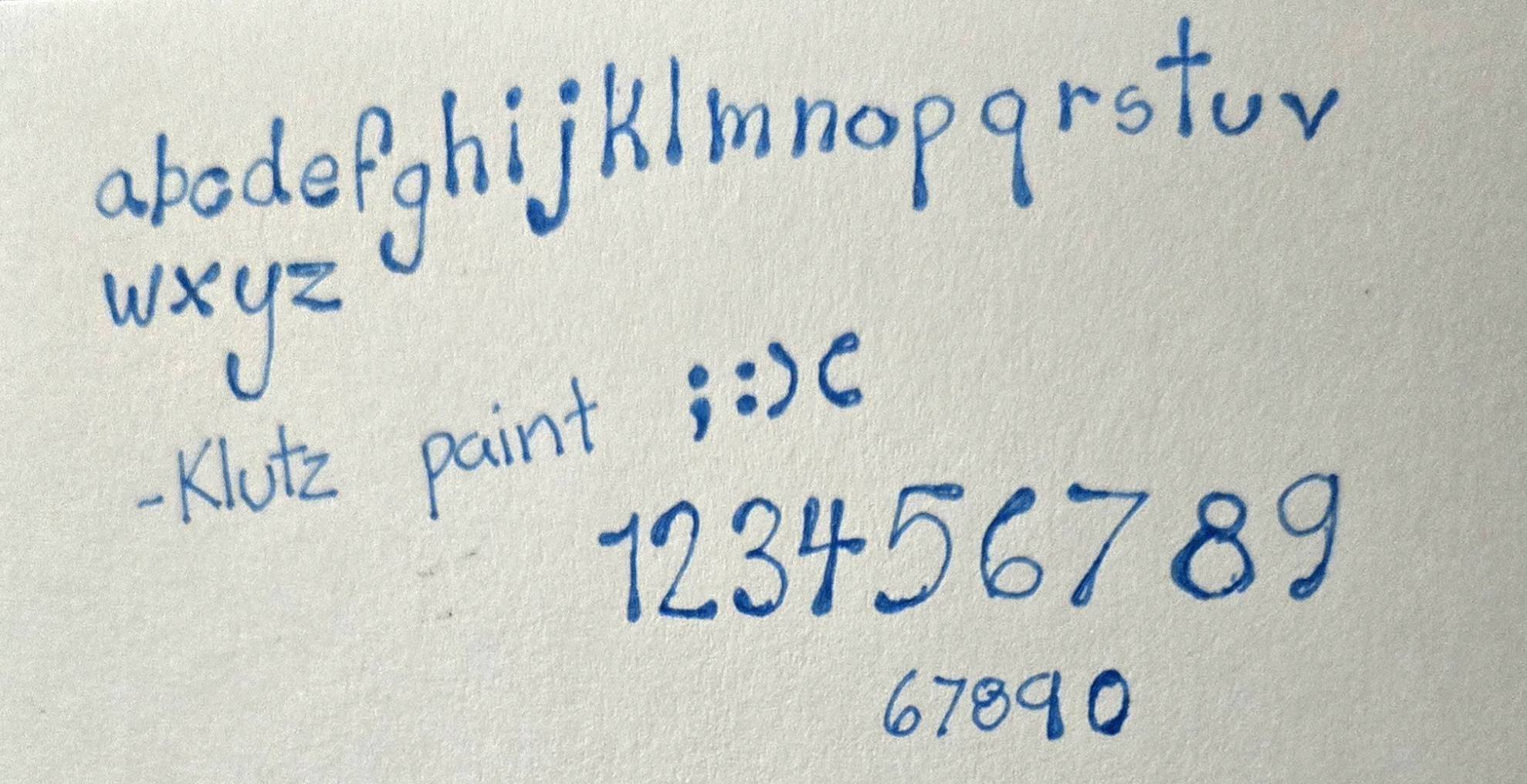
Creating a New Font
Keeping in mind that I wanted to still create a specimen page that still was very fun and playful, I started sketching out different characters for the typeface
I decided to go with something that varied in weight a lot, and looked very blobby that were reminiscent of face paint
Digitalizing
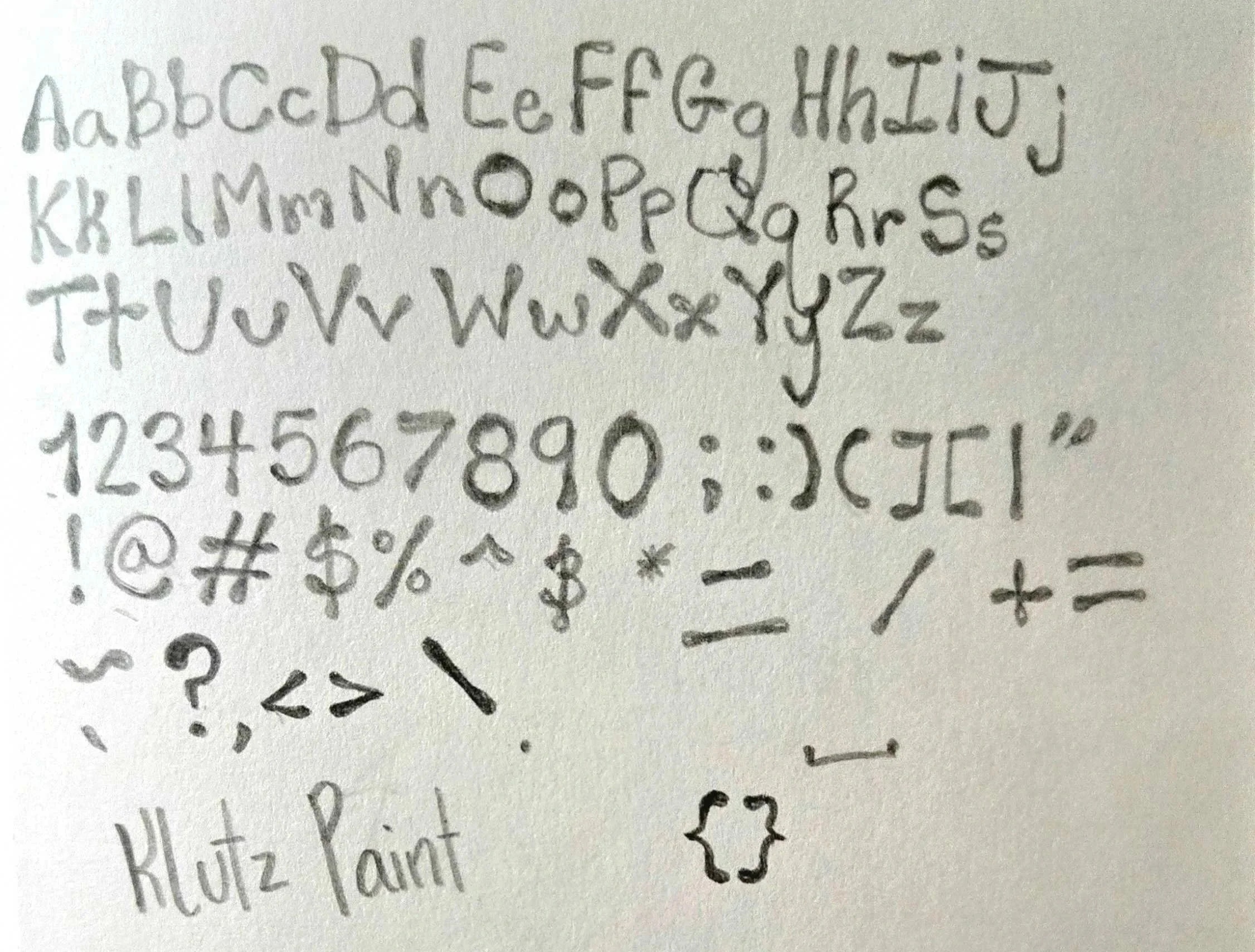
I originally brought in my sketches of the letters into Fire Alpaca, and traced over them to ensure I didn’t have any issues image-tracing them into vector shapes in illustrator.
I wasn’t the most satisfied with the results as some letters varied greatly compared to the others, so I redrew the characters digitally with guides to make sure they stayed relatively similar in size and style.
When getting the files set up and the font put together, it was a bit of trial and error, adjusting the space around the individual characters so they didn’t appear so far apart when typed out.
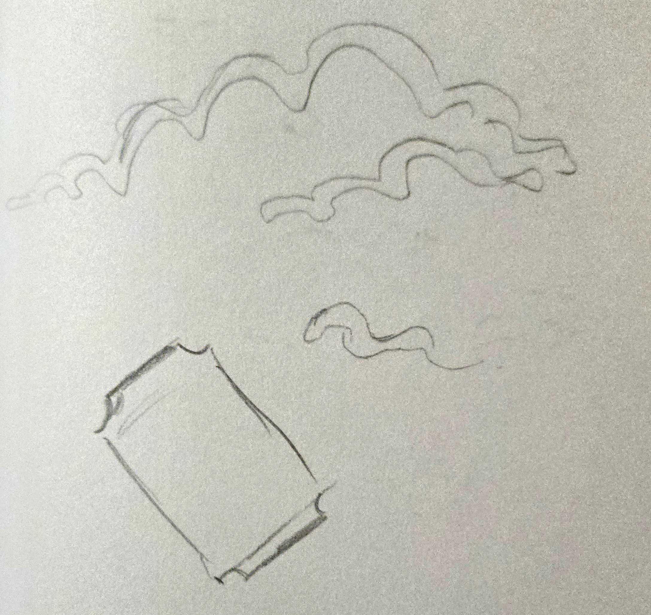
Sketches
Still keeping the circus theme I had used previously, I created new sketches of decorative elements and an idea of the main elements of the page.
Creating the Assets
Using Illustrator, I created several vector graphics for text boxes and different decorative elements, and created the layout for the specimen page. I made sure to include the information that felt important to display. I adjusted the color palette to be more centered around the primary colors for maximum playfulness, and added a bit more saturation to them to make sure they didn’t feel so dull.
Final
Personal Review
This one was quite ambitious, and I had a lot of fun with it! This was the first time I created a font from scratch, and minus a few hiccups it was a very intriguing experience. It was quite the learning experience, and I’m glad I went through all the trouble and research to make it happen.