
Dog Walk Poster
The goal of this project was to create a promotional poster for the Mighty Texas Dog Walk, looking into color psychology to make sure the color palette matched the emotion.
Initial Process
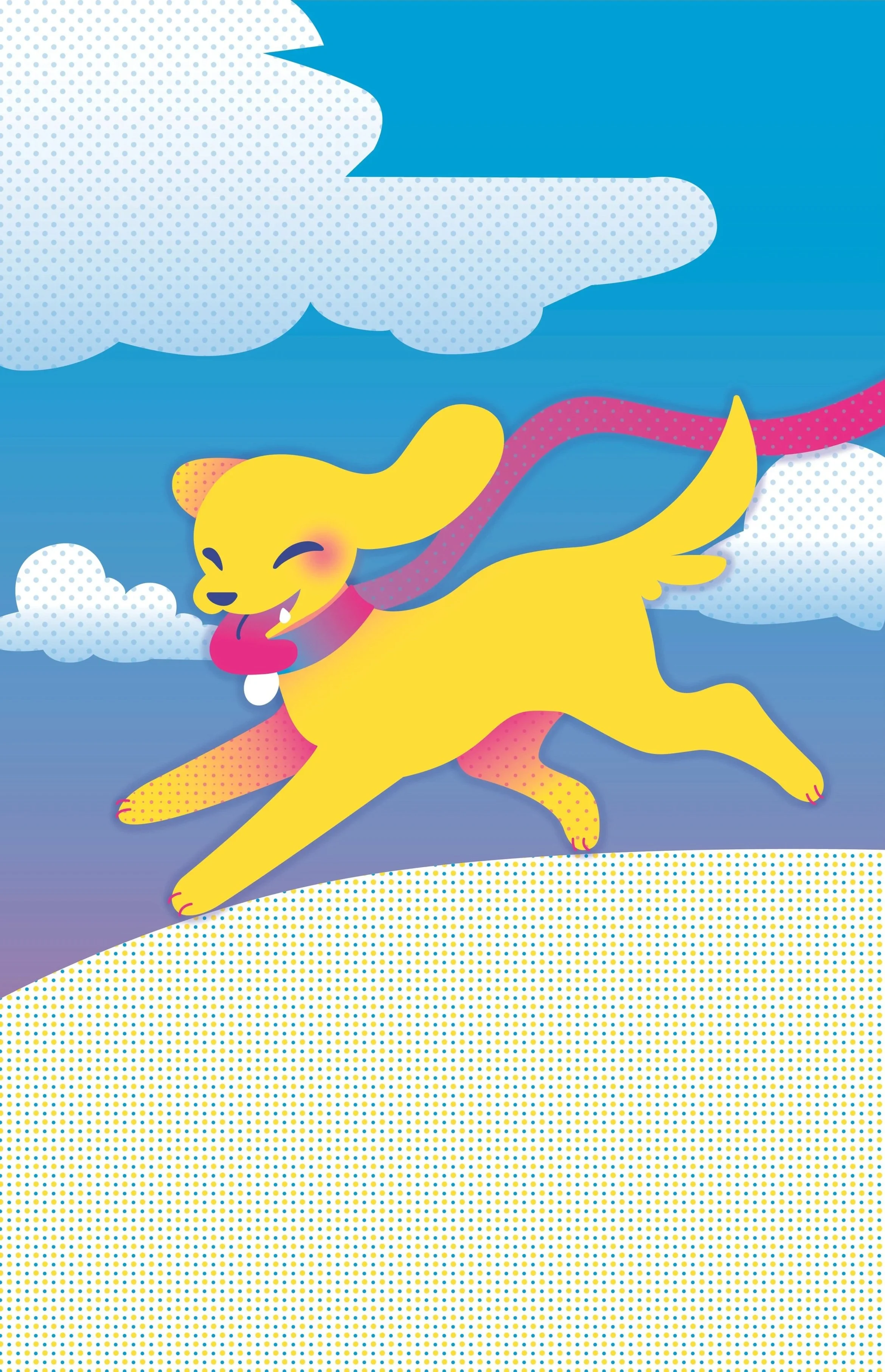
Sketch & Color Scheme
Aiming for a playful and energetic feeling to match the nature dogs tend to have, I incorporated some fun motion into my sketch, and chose a color scheme to really amplify those emotions.
Putting it all together
Going into Illustrator, I created the artwork. To keep my color palette limited to the colors I had selected, I used gradients and screen tones to get the appearance of additional colors and to add shading and depth to the graphics. To help the text stand out against the background, I created text bubbles to give the text a solid surface to sit on.
Revisiting
Of course there are always ways to improve something, and the poster just needed a nudge in the right direction.
Feedback I Received
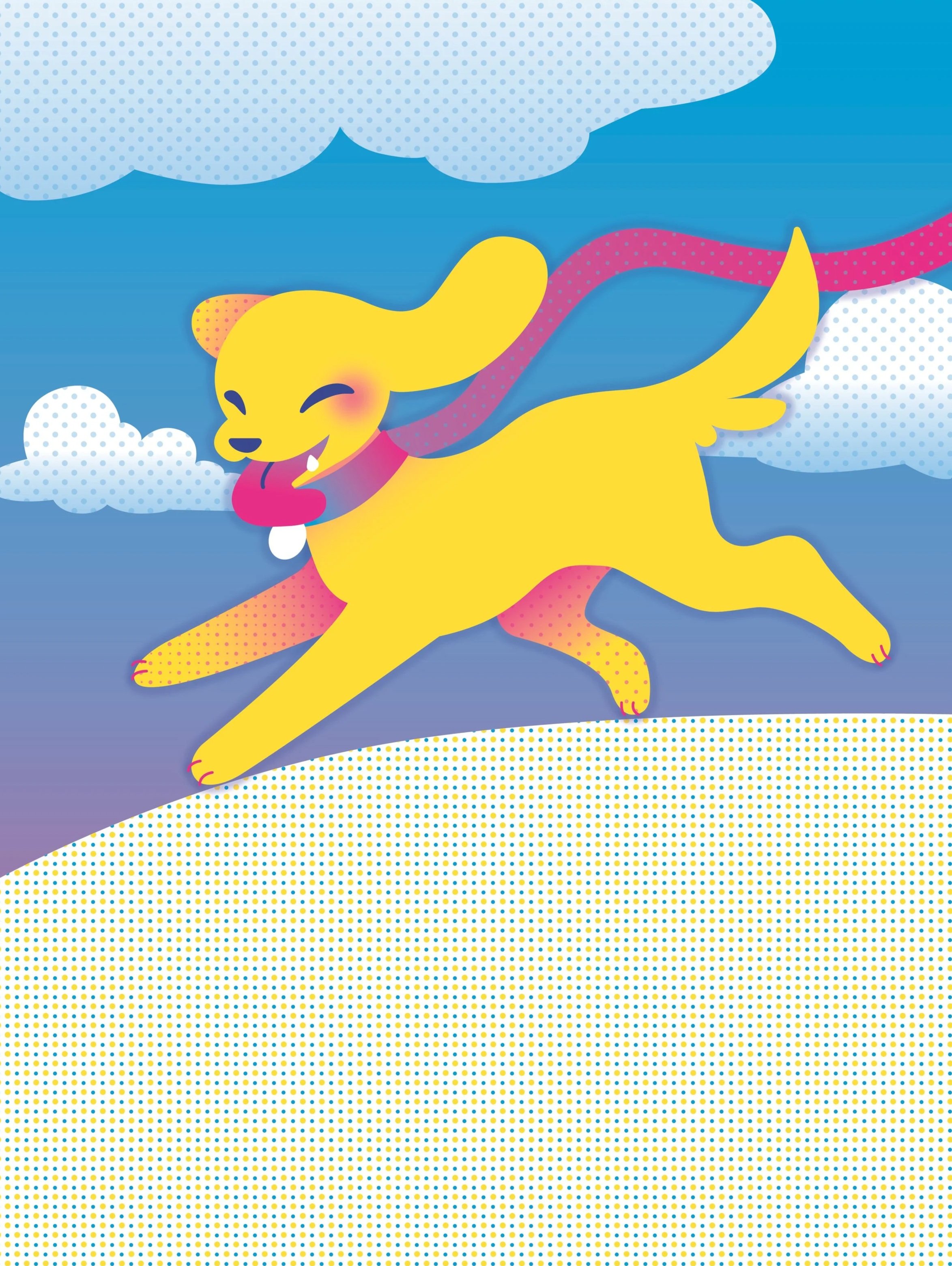
Looking to my peers for feedback, I got plenty of notes on how I could improve the design. It seems that the black outlines may not have been the bestest choice to make, as the illustration may be stronger without it. I got additional notes about the typography, mainly in the contents of the text, and the amount of font sizes I had. Another thing that was mentioned was including a QR code for convenience in real-world application.
Implementing feedback
The first thing I did was isolate the graphics from the poster, cleaning them up to be much smoother visually.
Cleaning up the artwork
I got rid of the black outlines, and it honestly helped elevate the design a lot, with minor adjustments to shading, I was able to keep the contrast.
I updated the text to include the year to the header.
I reduced the amount of text sizes
I added a QR code, and adjusted the color and feel to better incorporate it into the poster
Final
Personal Review
This was a super fun project for me overall! I love getting to research color psychology and designing with it in mind!