
Design Tokens
The goal was to design a home page for a wellness app that included a small summary of fitness, health, and sleep information that utilizes design tokens so it could be themeable.
Initial Process
Feedback I received:
Sketches
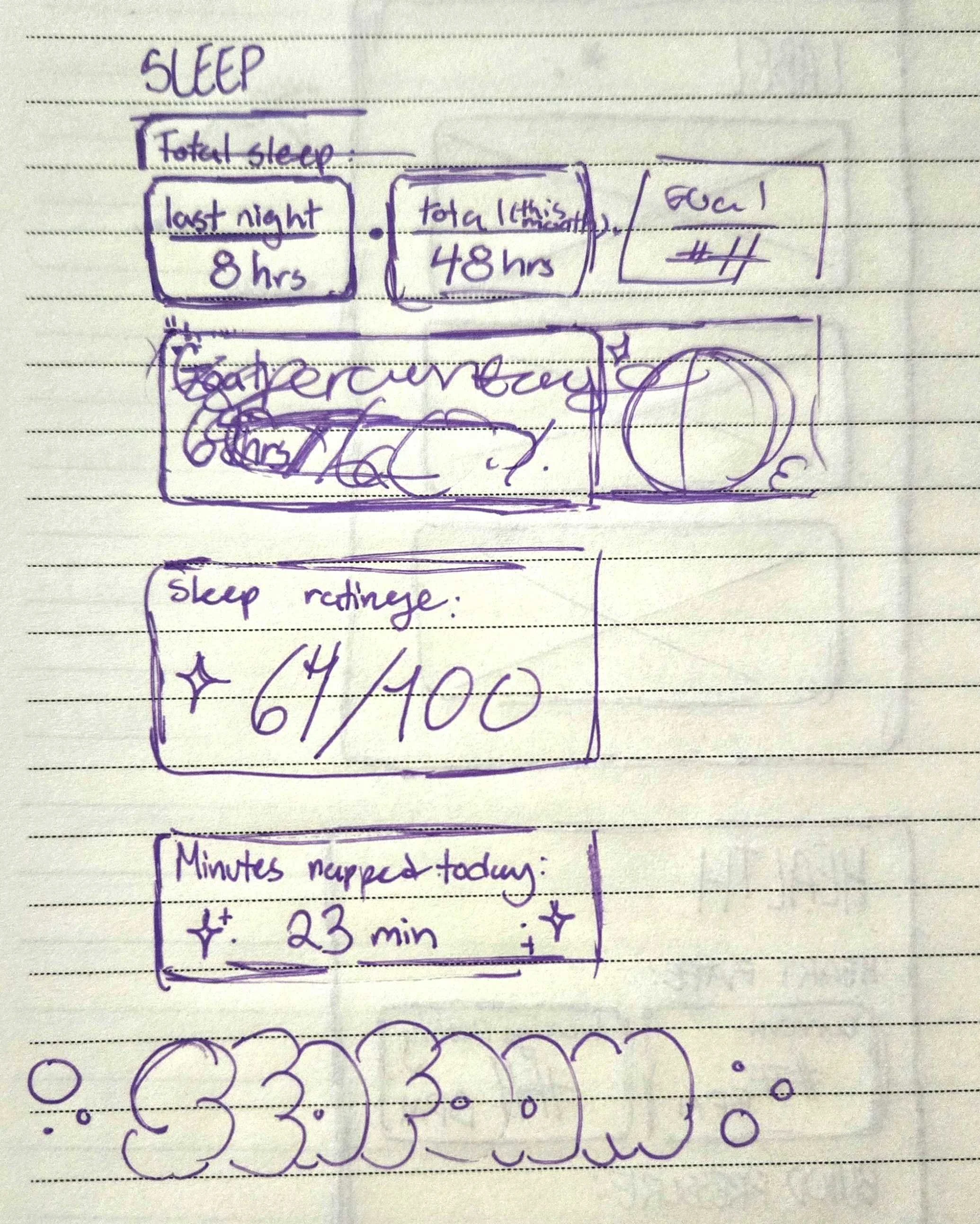
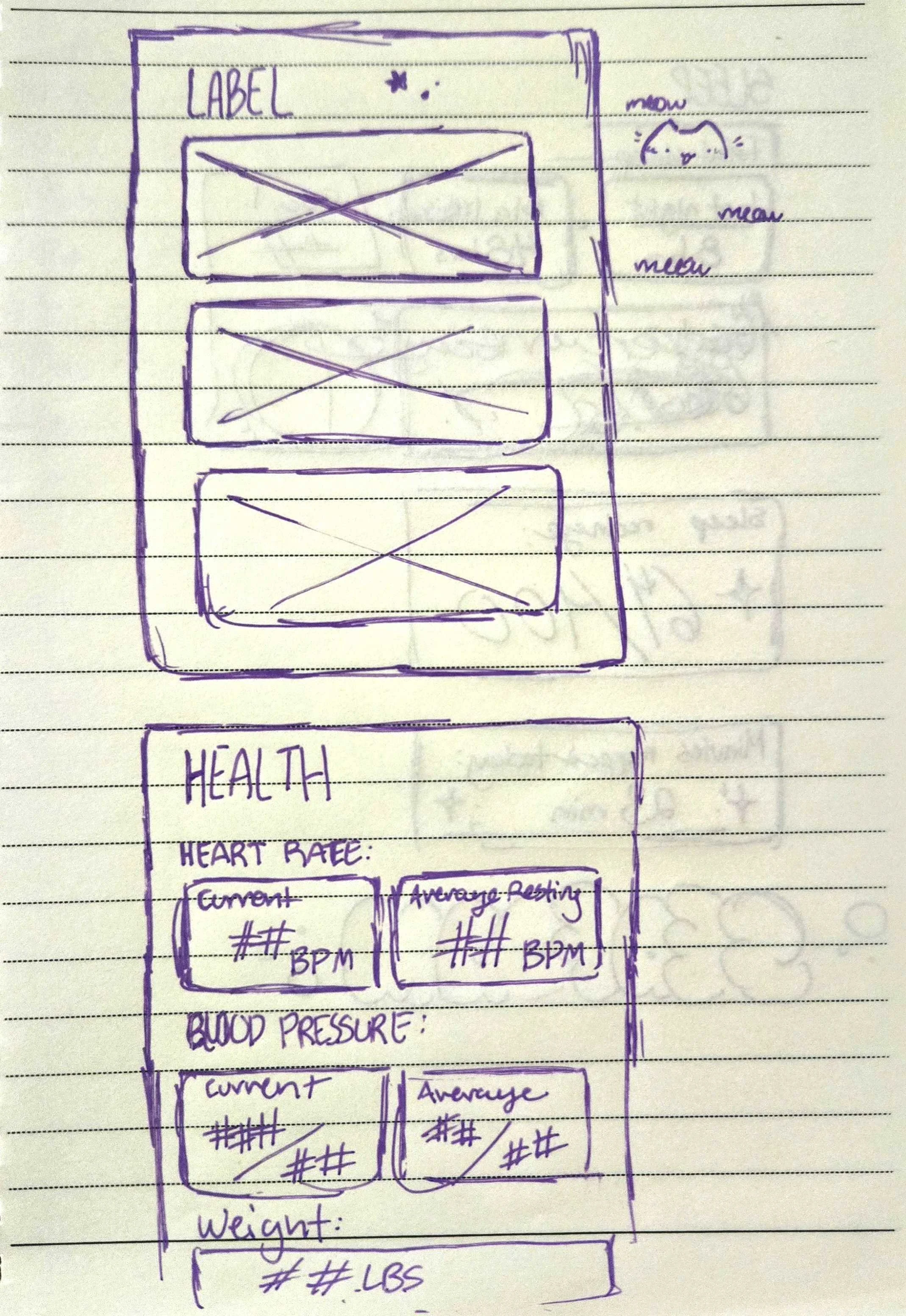
Given the data I was made to display, I sketched out different modules to display that information in a useful way. I then sketched out some icons for the navigation and wireframes for the overall layout.
Low - fi
Going into Figma, I created a grid and began creating my components (perhaps not in the prettiest way, but getting things in place and adjusted before polishing.
Version One
The feedback I received for this was quite insightful, including to mock it up properly on a phone screen, and adjusting any elements that may feel too big.
Creating a style guide
Having in mind the themes I wanted to design for the app, I created a page to act as a style guide. I took note of all the text styles and variables (number and color) with a description to inform what each variable is used for.
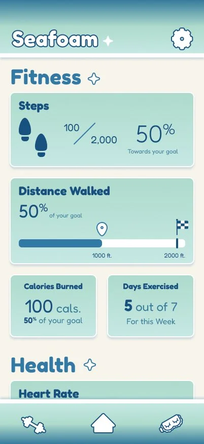
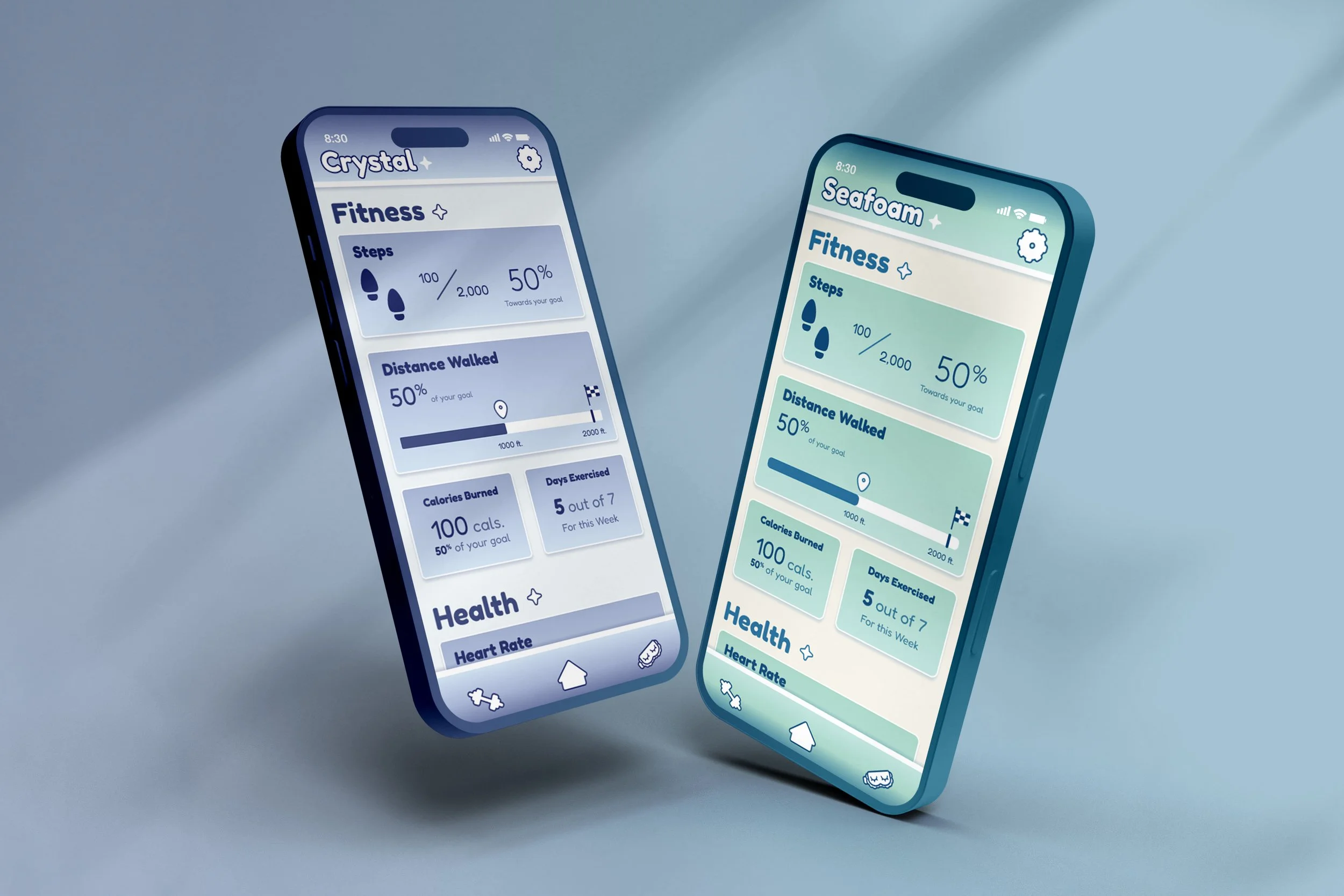
The two main themes I created was Seafoam and Crystal.
Seafoam contains a variety of teal shades, with a background of a sandy cream color to mimic the sand and rounded corners to create a more comfortable and casual appearance.
Crystal contains a variety of muted blue shades, with a cool, off-white background and less rounded corners to create a more clean and polished appearance.
Final
Personal Review
This was a super interesting project, as designing with variable tokens is a lot more tricky than I thought it would be, making absolute sure that everything visually works when you change them. It made picking colors more precise, and challenged me to make something not only aesthetically pleasing to look at, but also readable.
Revisions I made:
adjusted sizing for proper mockup
adjusted size of the icons to better fit a phone screen